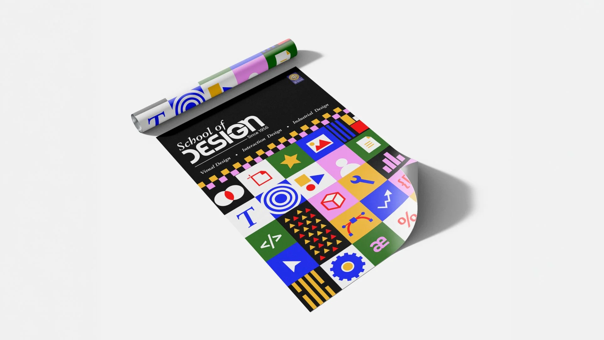
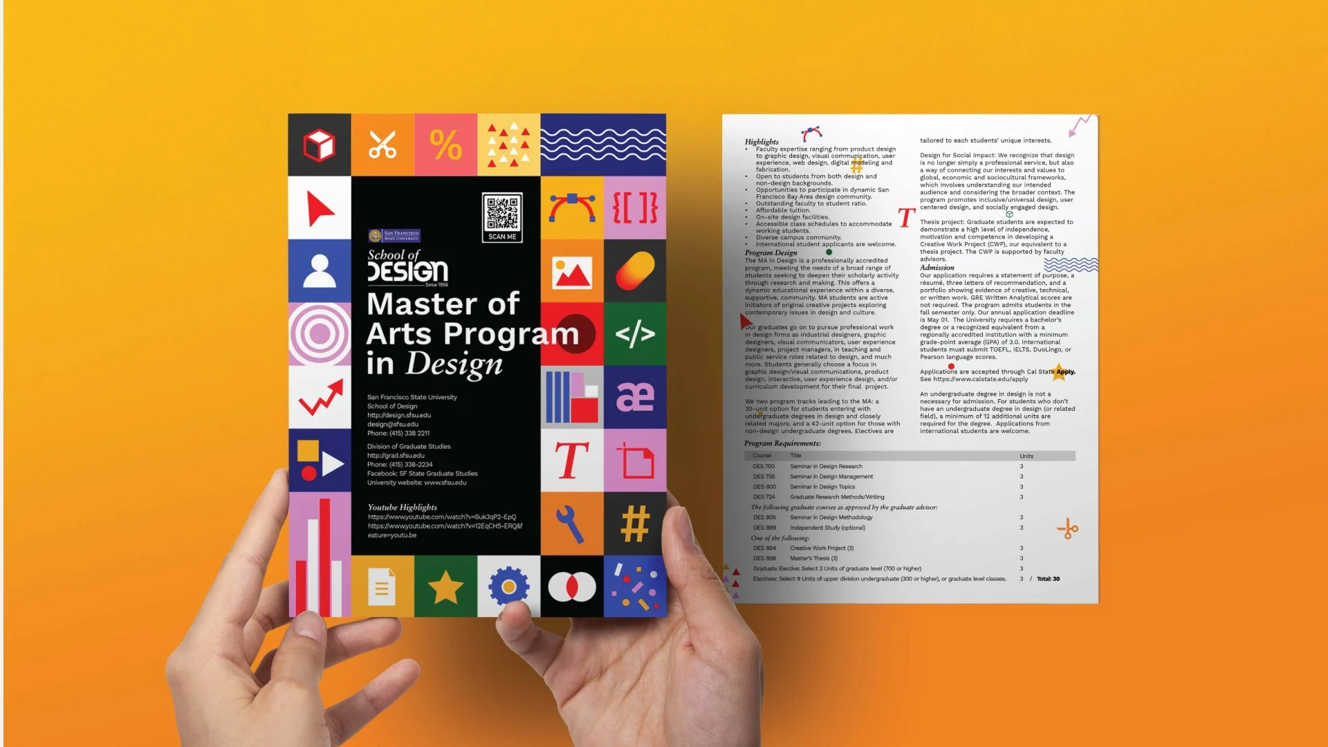
San Francisco State University School of Design
Role
Brand Designer
Scope
Visual identity, typography, color, layout system, brand guidelines, and applications
Overview
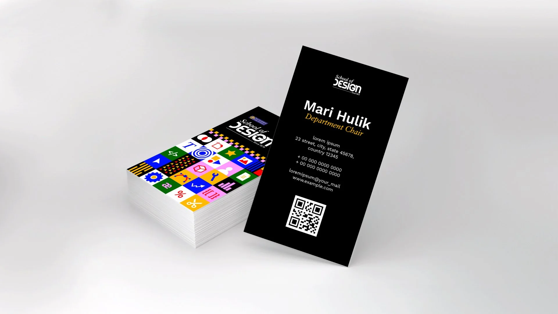
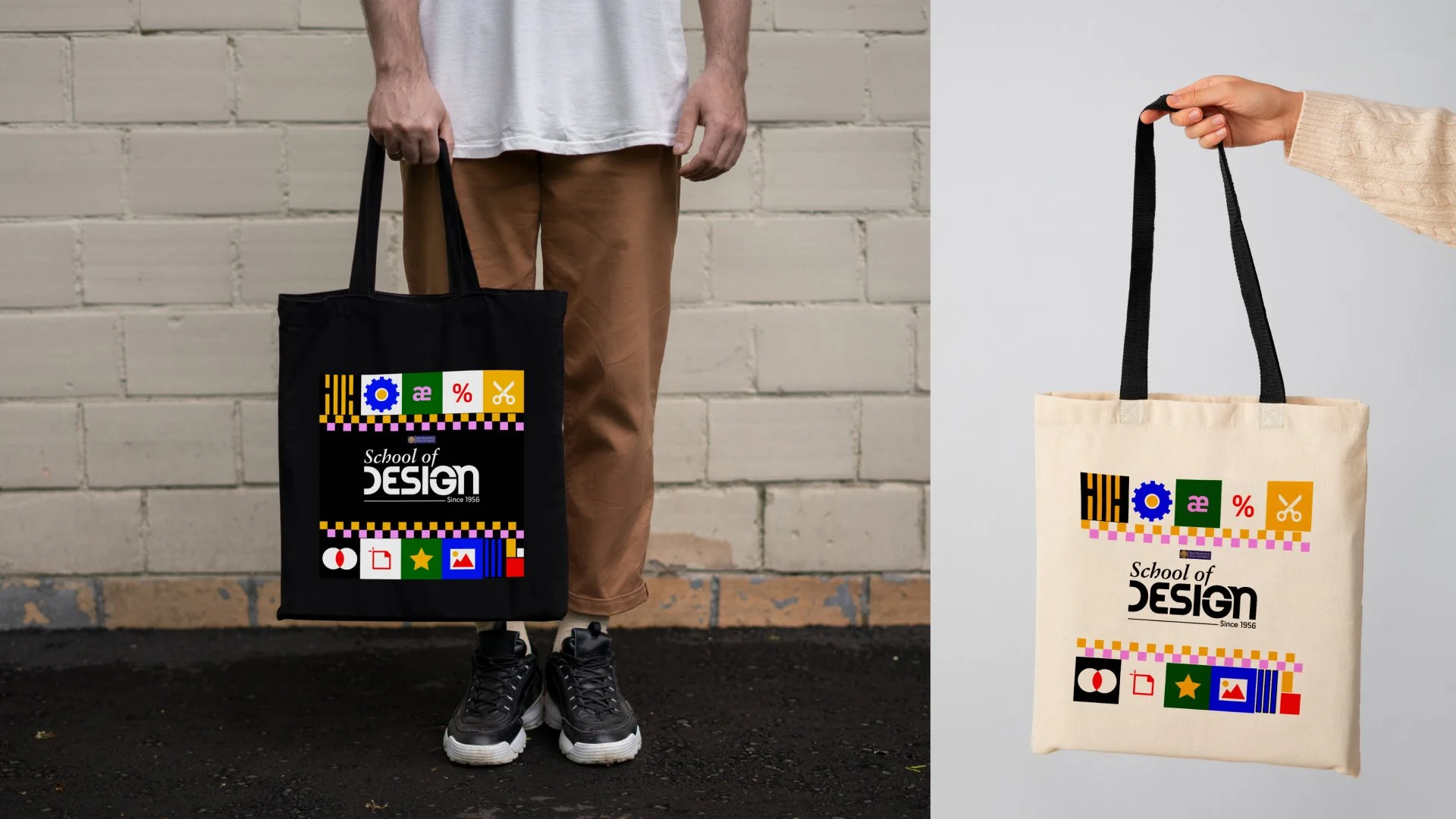
Redesigned the brand identity system for San Francisco State University’s School of Design, creating a more cohesive visual language for academic, public-facing, and internal communications. The system used typography, color, layout, and graphic elements to reflect the school’s diverse faculty, students, and interdisciplinary design culture.
The Challenge
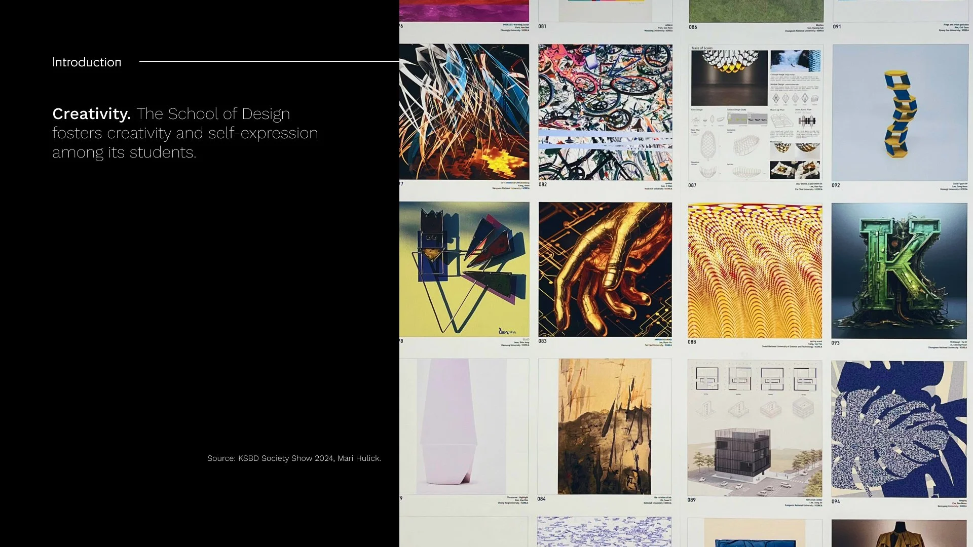
The School of Design had no cohesive identity. Visual language was fragmented across departments, applied inconsistently with no shared guidelines, and felt dated against the forward-looking, interdisciplinary culture it was meant to represent. Every program was effectively designing for itself.
The Approach
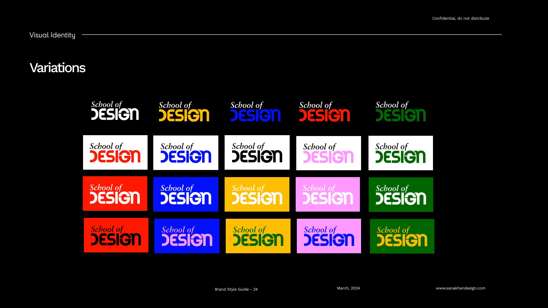
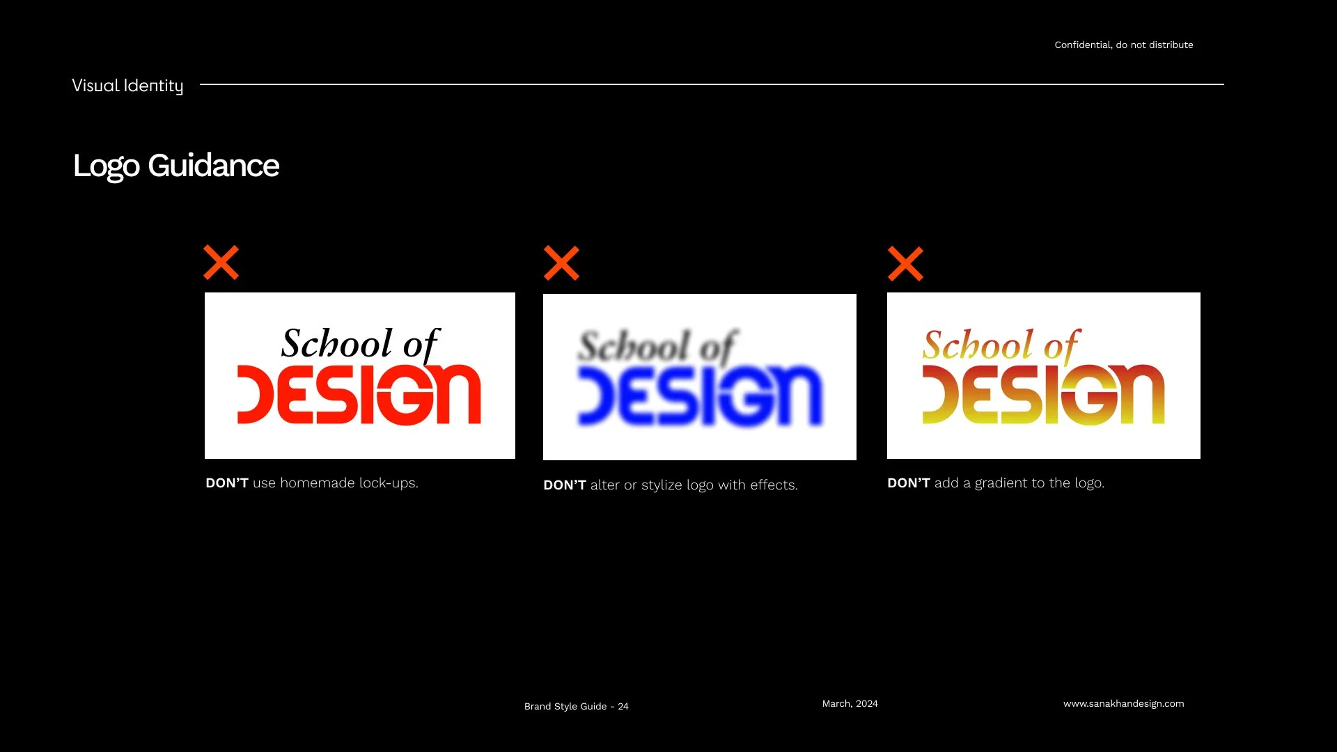
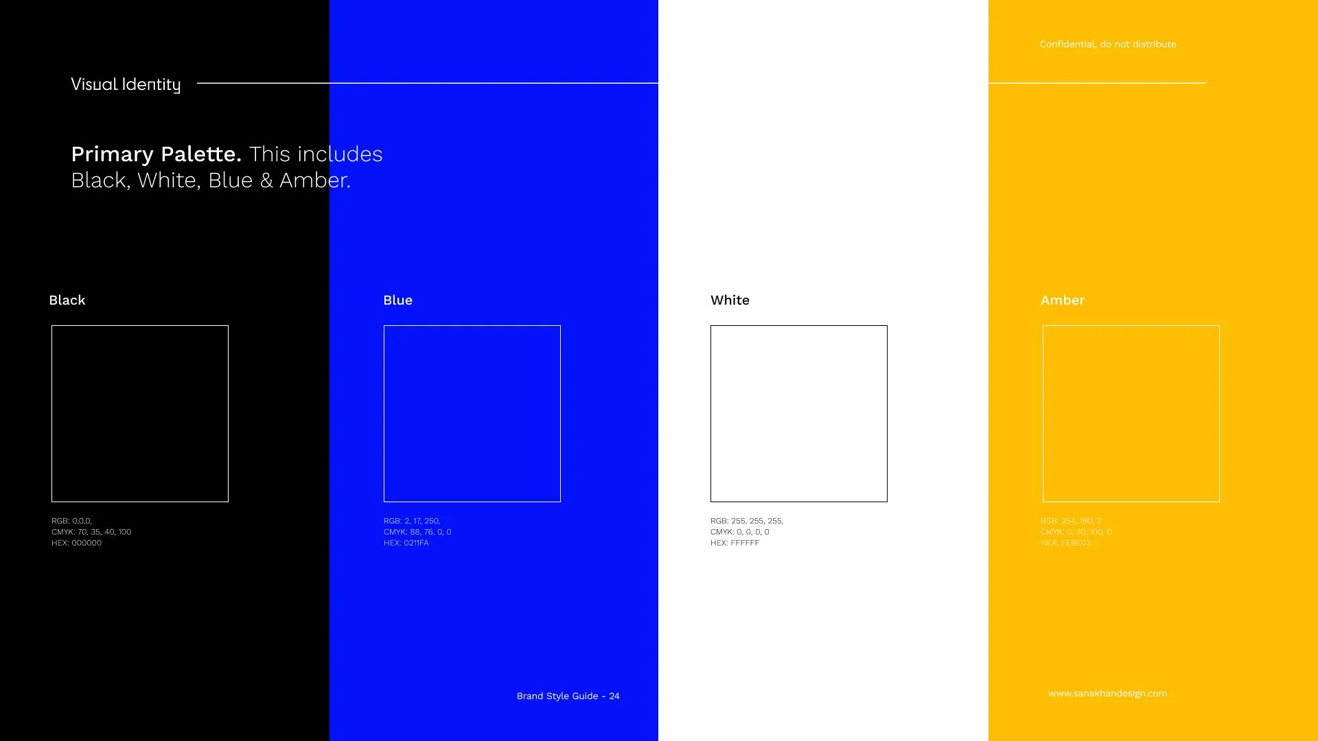
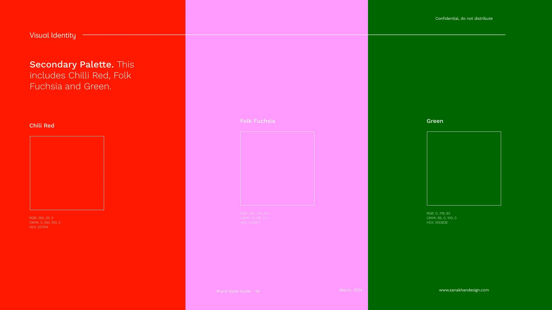
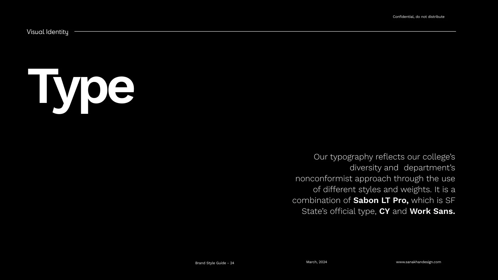
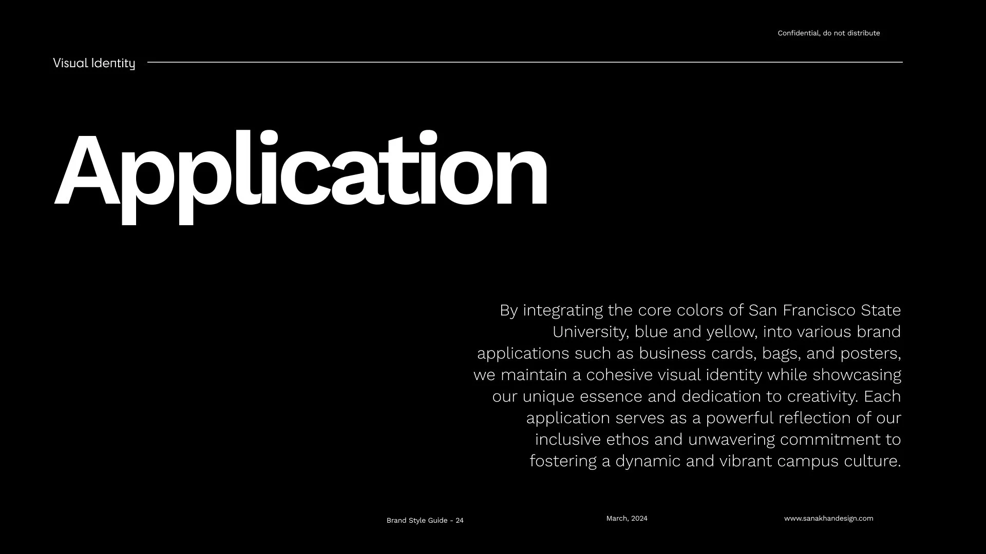
I treated this as a systems problem, not a logo refresh. Working from the school's own archive and the breadth of its degree programs, I developed a flexible visual language, custom typography, a modular layout system, and clear color and graphic rules, designed so any department could build on it without breaking it. As both a designer and an educator here, I built the system the way I teach: rigorous and documented, but open enough to leave room for creative momentum.



The System
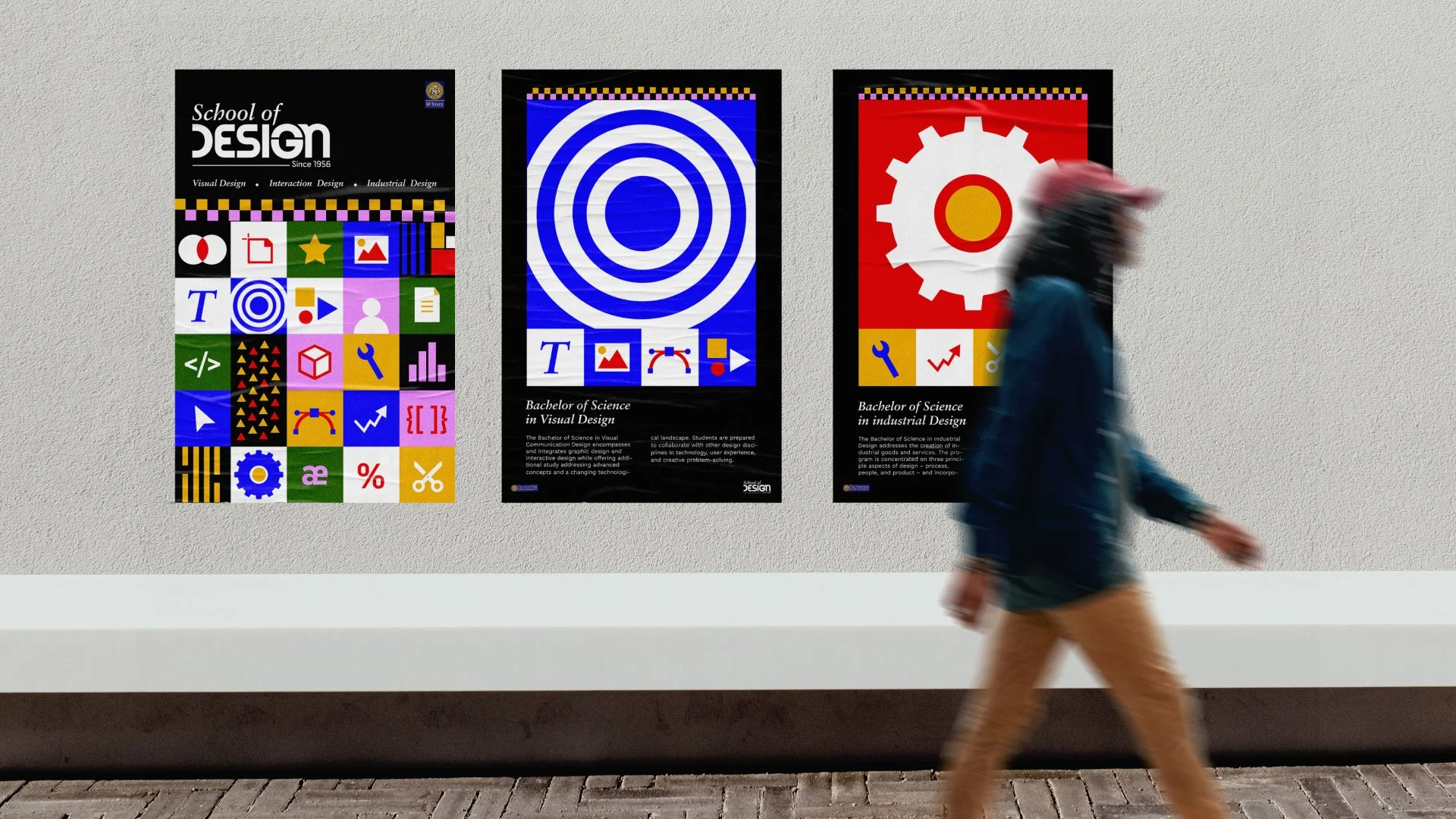
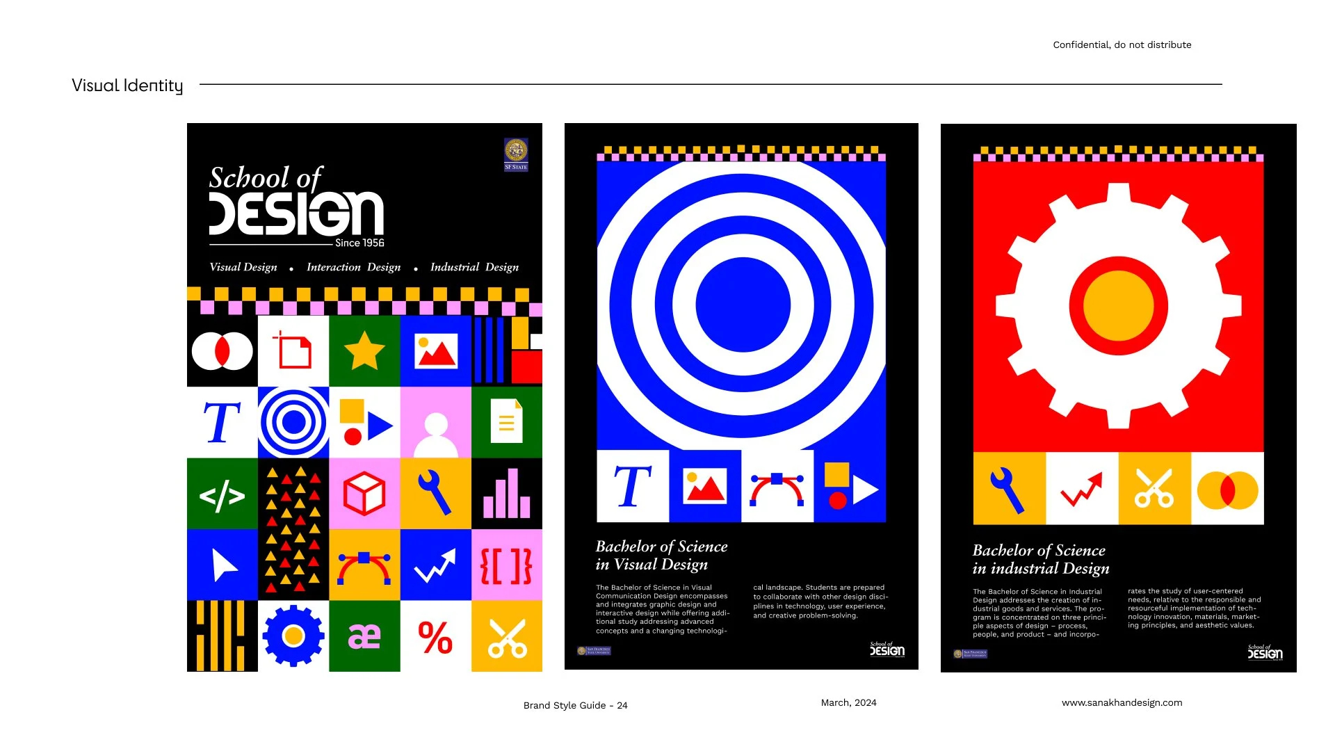
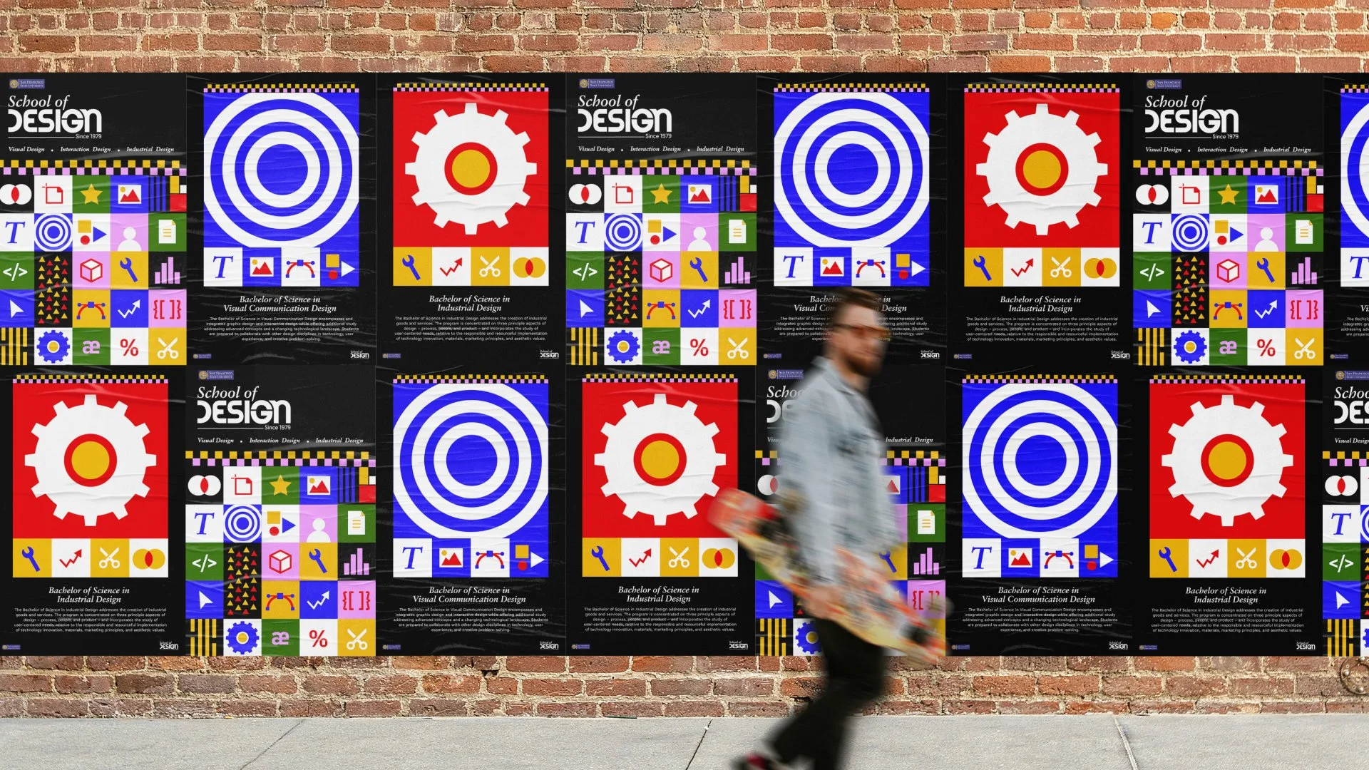
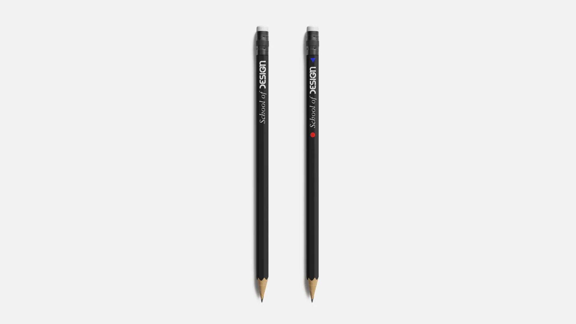
The result is a single, recognizable identity that flexes across academic, public-facing, and internal communications, from event posters and publications to digital and environmental applications. The diversity of the student body and faculty became the system's strength: one language, many voices.












The Impact
The identity is now the School of Design's official, living brand system. In its first cycle, it contributed to a 42% increase in event attendance, evidence that a clear, cohesive identity does not just look better, it brings more people in.